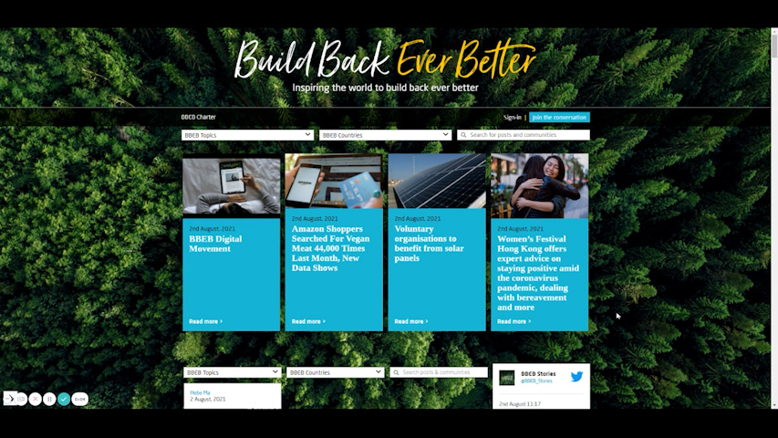
I came across this image on social media,and was taken aback by how powerful the message is.
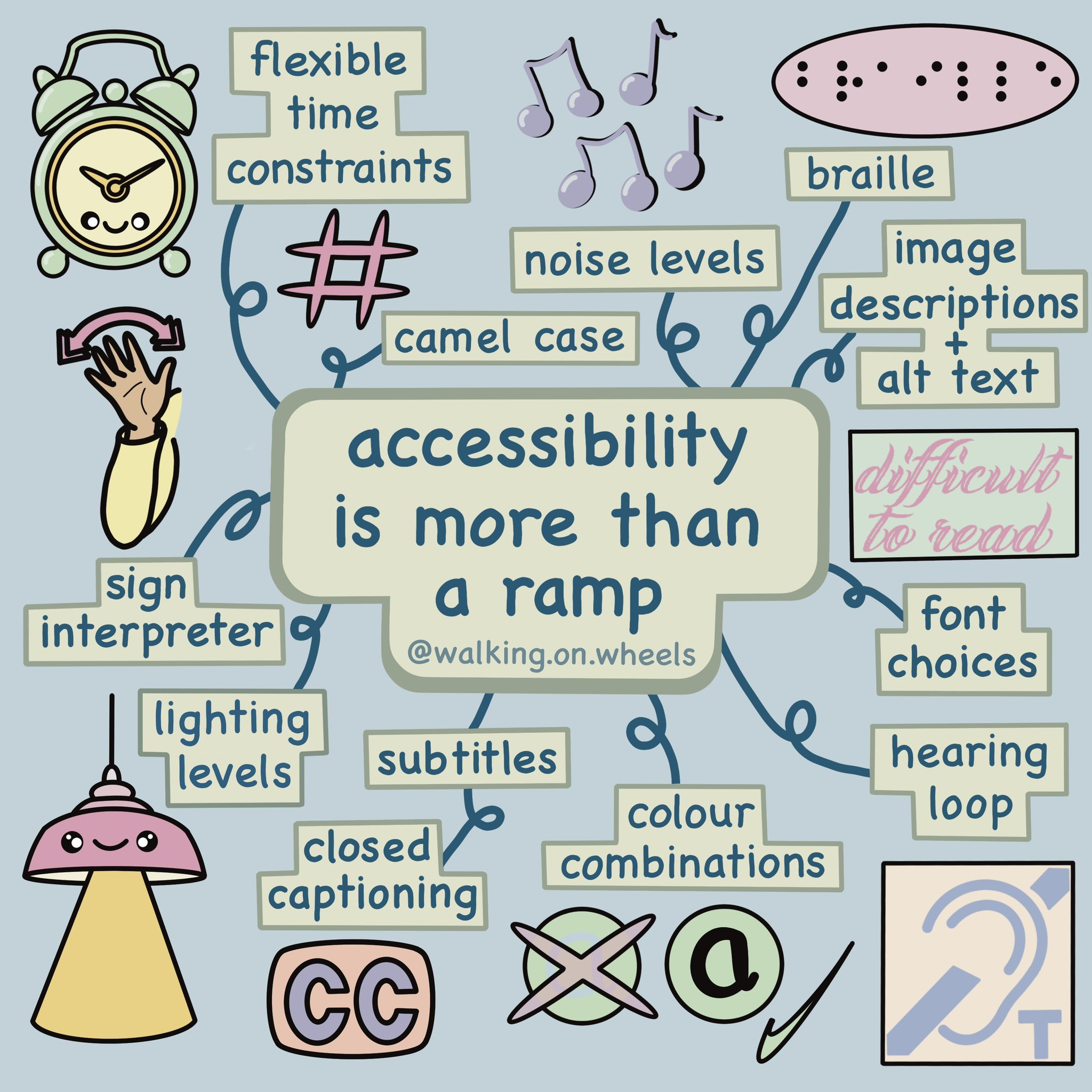
Check out the original post on Twitter and give Katy (@walkingonwheels) a follow.
Accessibility needs to be part of building back ever better.
Image Description:
A kawaii style illustration on the topic of access needs. In the centre are the words “accessibility is more than a ramp” which is then surrounded by examples of access needs. Starting from the top left corner and working clockwise… “flexible time constraints” and a drawing of an alarm clock. “camel case” and a drawing of a hashtag. “noise levels” and a drawing of musical notes. “Braille” and a drawing of the word Braille written in Braille. “image description + alt text” there’s no drawing with this one. “font choices” and a drawing of overly decorative font. “hearing loop” and a drawing of the hearing loop logo. “colour combinations” and a drawing of two examples of combinations, one clear and one very unclear. “subtitles and closed captioning” and a drawing of the closed captions CC logo. “lighting levels” and a drawing of a ceiling light and light beam. “sign interpreter” and a drawing of an arm demonstrating the way to say hello in BSL. The background of the slide is pale blue
walking.on.wheels I’m posting this again because it can’t be said too many times. The one bit that seems to stump a lot of people is camel case. For those that don’t know, take a look at my hashtags to see it in action. It is the capitalising of the first letter of every word, when words are conjoined without spaces. Accessibility wise, it makes words written in this way easier to read, and it means that screen readers will read each individual word as it was intended.
https://twitter.com/WalkingOnWheels/status/1462141850580574214


/Passle/60211dc9e5416a0c14bc63d4/SearchServiceImages/2026-06-12-19-54-45-128-6a2c6405c607355fa8a53cf0.jpg)