This series is inspired by the excellent posters published on the GOV.UK Accessibility Blog. They were originally created for government services, but the advice applies everywhere - from e-commerce to healthcare to education.
Each part takes one of the posters, shares the official Do’s and Don’ts, and adds my own perspective on why it matters in practice.
I’ve seen interfaces so chaotic they made me want to shut the laptop and walk away. For someone on the autism spectrum, overwhelming design can mean they literally can’t use your product.
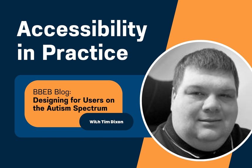
Designing for users on the autistic spectrum
Do
- use simple colours
- write in plain English
- use simple sentences and bullets
- make buttons descriptive - for example, Attach files
- build simple and consistent layouts
Don't
- use bright contrasting colours
- use figures of speech and idioms
- create a wall of text
- make buttons vague and unpredictable - for example, Click here
- build complex and cluttered layouts

Why it matters
Consistency and calmness make your product easier to use. And who doesn’t benefit from less chaos?
Takeaway: Clarity and calm design help everyone stay focused.
The dos and don’ts of designing for accessibility are general guidelines, best design practices for making services accessible
https://accessibility.blog.gov.uk/2016/09/02/dos-and-donts-on-designing-for-accessibility/
 unknownx500


/Passle/60211dc9e5416a0c14bc63d4/SearchServiceImages/2026-06-12-19-54-45-128-6a2c6405c607355fa8a53cf0.jpg)