
I have lost count of the number of times someone has told me, “It’s fine, it’s colour coded.”
They always say it with confidence.
And they are almost always wrong.
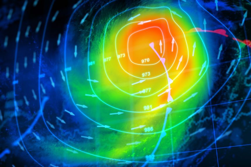
This matters even more when colour is used to communicate risk or safety. Weather maps are a perfect example. They are watched by millions of people, often in stressful situations, and they rely heavily on colour to convey meaning.
Recent research highlights just how fragile that assumption is, and why changing the underlying standards could make weather information more accessible to everyone once those standards are adopted.
This is not about adding an accessibility mode. It is about fixing the system itself.
The research and why weather maps matter
The research focuses on how people with different forms of colour blindness perceive colour relationships, not just individual colours. The team looked at real-world use cases, including weather visualisations, where gradients and colour transitions are commonly used to represent intensity, movement, and risk.
On a typical weather map, rain, snow, heat, wind, and storm severity are often encoded using colour alone. Greens blend into yellows, yellows into reds. For many colour blind viewers, those distinctions collapse. What looks like a clear escalation to one person can appear almost flat to another.
The researchers argue that by redefining colour standards used in these maps, broadcasters and meteorological services can make weather information more robust for everyone. Once adopted, these improved standards would not require viewers to change anything. The benefit would simply be there.
That is an important point. Accessibility at the standard level scales effortlessly.
Colour as a system, not a palette
One of the strongest ideas in the research is that colour should be treated as a system of relationships, not a collection of visually pleasing shades.
The question is not “Does this colour look nice?”
It is “Does this colour remain distinct from the others when perception changes?”
In weather maps, this means:
Ensuring adjacent intensity levels remain clearly separable
Avoiding gradients that collapse into a single tone
Preserving meaning even when colour perception is reduced
When colour systems are designed this way, they survive more than colour blindness. They work better on low-quality screens, in bright sunlight, on printed pages, and for ageing eyes.
Why changing the standard helps everyone
Weather maps are not created in isolation. They are built on shared conventions and standards used across broadcasters, apps, and public services.
If those standards improve, accessibility improves everywhere at once.
A colour blind viewer no longer has to guess whether a storm is intensifying.
A tired commuter glancing at a phone in bright daylight gets clearer information.
A black-and-white printout still communicates risk.
This is what inclusive design looks like when it is done properly. Quiet. Universal. Effective.
Best practice: never rely on colour alone
This research also reinforces a long-standing best practice in accessibility: never use colour as the only way to convey information
Colour can support meaning, but it should not carry it alone.
A simple example:
Do not use a green dot and a red dot to indicate status
Use a green tick and a red cross instead
Even if the colours are removed entirely and the display becomes black and white, the meaning remains obvious.
The same principle applies to weather maps. Symbols, patterns, labels, and motion cues can all reinforce what colour is suggesting. When colour fails, the information does not.
The wider lesson
This is not just about weather. It is about how easily accessibility problems hide in plain sight.
Weather maps usually work for most people most of the time, so the failures go unnoticed. But when the stakes are high and the information matters, those failures are not trivial.
The research is a reminder that accessibility is often about questioning defaults.
Why this colour?
Why this gradient?
What happens when perception changes?
The takeaway
By rethinking how colour standards are defined, particularly in high-impact areas like weather maps, this research shows a clear path toward more accessible information for everyone.
Once adopted, these changes do not single anyone out. They simply make the information clearer, more resilient, and more usable.
And that is exactly what good accessibility should do.
Related Articles:

/Passle/60211dc9e5416a0c14bc63d4/SearchServiceImages/2026-06-18-16-44-30-611-6a34206e05282cc6e3bb6fe8.jpg)
/Passle/60211dc9e5416a0c14bc63d4/SearchServiceImages/2026-06-17-18-10-57-083-6a32e3316f715bb75a811bb0.jpg)
/Passle/60211dc9e5416a0c14bc63d4/SearchServiceImages/2026-06-17-14-50-34-363-6a32b43a4a5ad1a81065995f.jpg)