This series is inspired by the excellent posters published on the GOV.UK Accessibility Blog. They were originally created for government services, but the advice applies everywhere - from e-commerce to healthcare to education.
Each part takes one of the posters, shares the official Do’s and Don’ts, and adds my own perspective on why it matters in practice.
I’ve lost count of the number of times I’ve zoomed into a website only to have the text overlap, menus disappear, and the whole page break apart like a bad puzzle. For people with low vision, that’s an everyday frustration.
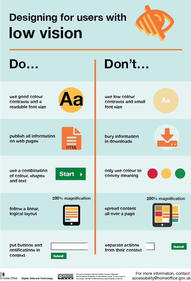
Designing for users with low vision
Do
- use good contrasts and a readable font size
- publish all information on web pages (HTML)
- use a combination of colour, shapes and text
- follow a linear, logical layout -and ensure text flows and is visible when text is magnified to 200%
- put buttons and notifications in context
Don't
- use low colour contrasts and small font size
- bury information in downloads
- only use colour to convey meaning
- spread content all over a page -and force user to scroll horizontally when text is magnified to 200%
- separate actions from their context
Why it matters
Good contrast isn’t a compromise — it’s what makes your design usable. And text that reflows at larger sizes prevents frustration.
Takeaway: Design so text grows, colours work, and pages don’t fall apart.
The dos and don’ts of designing for accessibility are general guidelines, best design practices for making services accessible
https://accessibility.blog.gov.uk/2016/09/02/dos-and-donts-on-designing-for-accessibility/
 unknownx500


/Passle/60211dc9e5416a0c14bc63d4/SearchServiceImages/2026-06-12-19-54-45-128-6a2c6405c607355fa8a53cf0.jpg)