This series is inspired by the excellent posters published on the GOV.UK Accessibility Blog. They were originally created for government services, but the advice applies everywhere - from e-commerce to healthcare to education.
Each part takes one of the posters, shares the official Do’s and Don’ts, and adds my own perspective on why it matters in practice.
Ever tried using your phone one-handed while carrying a bag of shopping or holding a child’s hand? Suddenly those small buttons, fiddly swipes, or double-tap gestures feel impossible. For many people with limited mobility or who only have the use of one hand, that’s not an occasional inconvenience — it’s the daily reality.
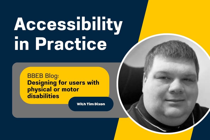
Designing for users with physical or motor disabilities
Do
- make large clickable actions
- give form fields space
- design for keyboard or speech only use
- design with mobile and touch screen in mind
- provide shortcuts
Don't
- demand precision
- bunch interactions together
- make dynamic content that requires a lot of mouse movement
- have short time out windows
- tire users with lots of typing and scrolling
Why it matters
If you can’t tab through your site logically, it’s broken. Tiny buttons or unforgiving timeouts make life harder than it needs to be.
Takeaway: If you build for speed and precision only, you’re leaving people behind.

The dos and don’ts of designing for accessibility are general guidelines, best design practices for making services accessible
https://accessibility.blog.gov.uk/2016/09/02/dos-and-donts-on-designing-for-accessibility/
 unknownx500


/Passle/60211dc9e5416a0c14bc63d4/SearchServiceImages/2026-06-12-19-54-45-128-6a2c6405c607355fa8a53cf0.jpg)