This series is inspired by the excellent posters published on the GOV.UK Accessibility Blog. They were originally created for government services, but the advice applies everywhere - from e-commerce to healthcare to education.
Each part takes one of the posters, shares the official Do’s and Don’ts, and adds my own perspective on why it matters in practice.
Think about watching a video on a train, in a busy café, or at your desk in an open-plan office. Even if you can hear perfectly well, the background noise makes spoken words hard to follow. Captions cut through the chaos, making content understandable in noisy environments. For people who are D/deaf or hard of hearing, they aren’t just helpful — they’re essential.
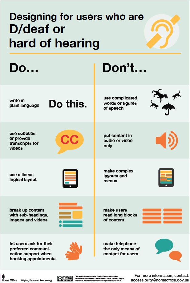
Designing for users who are D/deaf or hard of hearing
Do
- write in plain English
- use subtitles or provide transcripts for video
- use a linear, logical layout
- break up content with sub-headings, images and videos
- let users ask for their preferred communication support when booking appointments
Don't
- use complicated words or figures of speech
- put content in audio or video only
- make complex layouts and menus
- make users read long blocks of content
- don't make telephone the only means of contact for users
Why it matters
Captions aren’t just accessibility — they’re usability. Transcripts double as SEO gold.
Takeaway: If your content only works with sound on, you’ve already lost half your audience.
The dos and don’ts of designing for accessibility are general guidelines, best design practices for making services accessible
https://accessibility.blog.gov.uk/2016/09/02/dos-and-donts-on-designing-for-accessibility/
 unknownx500


/Passle/60211dc9e5416a0c14bc63d4/SearchServiceImages/2026-06-12-19-54-45-128-6a2c6405c607355fa8a53cf0.jpg)