
This series is inspired by the excellent posters published on the GOV.UK Accessibility Blog. They were originally created for government services, but the advice applies everywhere - from e-commerce to healthcare to education.
Each part takes one of the posters, shares the official Do’s and Don’ts, and adds my own perspective on why it matters in practice.
Imagine trying to read a page where the lines seem to dance, letters swap places, and the effort of decoding each word feels like running uphill. That’s the daily experience for many people with dyslexia. Good design choices — like clear fonts, shorter sentences, and plenty of white space — can make the difference between information that’s accessible and information that’s exhausting.
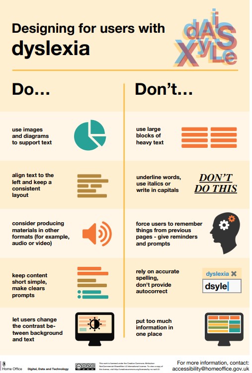
Designing for users with dyslexia
Do
- use images and diagrams to support text
- align text to the left and keep a consistent layout
- consider producing materials in other formats (for example, audio and video)
- keep content short, clear and simple
- let users change the contrast between background and text
Don't
- use large blocks of heavy text
- underline words, use italics or write capitals
- force users to remember things from previous pages - give reminders and prompts
- rely on accurate spelling - use autocorrect or provide suggestions
- put too much information in one place
Why it matters
Generous line spacing, short sentences, and simple fonts lower the barrier. That’s easier for everyone to read.
Takeaway: Good design for dyslexia is really just good design for everyone.

/Passle/60211dc9e5416a0c14bc63d4/SearchServiceImages/2026-06-17-14-50-34-363-6a32b43a4a5ad1a81065995f.jpg)
/Passle/60211dc9e5416a0c14bc63d4/SearchServiceImages/2026-06-17-13-06-06-531-6a329bbe4a5ad1a810653a68.jpg)