Accessibility Meets the Espresso Machine
Walk into most cafés and you can tell the space was designed for speed, not comfort. The counter’s too high, the lighting too harsh, the noise relentless. For many disabled customers, that is enough to turn a quick coffee stop into a small endurance test.
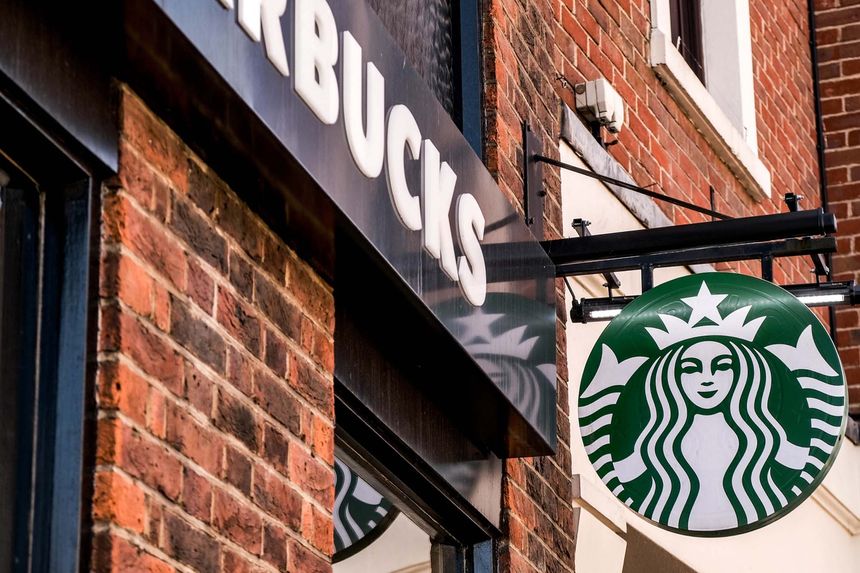
Starbucks has decided that needs to change.
At its new Union Market store in Washington, D.C., the company has unveiled a next-generation design that puts accessibility at the core, not as an afterthought. Sara Trilling, president of Starbucks North America, puts it simply: “Designing for disabilities is just good design for everybody.”
Two Years, Hundreds of Ideas
Starbucks spent two years rethinking what an inclusive café should look and feel like. They did not just ask architects. They asked baristas. That matters because the people behind the counter experience the flow of customers, the challenges of layout and the strain of equipment better than anyone.
The result is a space where accessibility feels natural. The floor plan is open and unobstructed, allowing customers to move freely. The lighting is soft and even, reducing glare and shadow. Acoustic insulation cuts down the constant hum of espresso machines and conversations. These might sound like small changes, but together they make the environment calmer and far more welcoming.
Designing the Details
Start at the door. It opens automatically, giving independence to wheelchair users, parents with prams or anyone juggling bags and drinks.
At the counter, the height has been lowered so customers and baristas can meet at eye level. The new point-of-sale terminals tilt, magnify text, read aloud and display photos of menu items. That helps blind and low-vision customers, but it also benefits anyone with limited English, dyslexia or anxiety about ordering correctly.
Behind the counter sits the Clover Vertica brewing system, a redesigned coffee machine with large tactile dials and indicator lights that make operation more intuitive.
Starbucks also updated the drink collection process. Digital status boards show order names while baristas still call them out. That combination supports both hearing and deaf customers and makes the process smoother for everyone.
Inclusion That Doesn’t Cost More
Building accessible cafés does not have to cost more. Trilling confirmed that these new designs are no more expensive than previous layouts. The difference is not in the budget but in the mindset.
Accessibility should not be seen as an upgrade. It should be the blueprint. By re-engineering how space, light, sound and interaction work together, Starbucks is not just serving coffee. It is serving connection.
Trilling said it clearly: accessibility improves both “customer connection” and “employee engagement.” Staff benefit from clearer layouts and quieter spaces. Customers benefit from feeling welcome and included.
Why This Matters
The Union Market café is the first of many. Starbucks plans to open more than 600 new U.S. stores this year, all following the same inclusive framework. That is a major shift for a brand of this scale and one that could influence how others approach accessibility in public spaces.
Accessible design should not need to be marketed. It should be the standard.
When a business as visible as Starbucks integrates inclusion into its stores, it raises expectations everywhere. The next time you walk into a café, you might notice wider paths, softer light and a counter you can actually reach. That is the impact of designing with empathy.
The Real Takeaway
Starbucks’ new design is not a token gesture toward disability inclusion. It shows what happens when accessibility becomes a design principle rather than a checkbox.
The company could have stopped at basic compliance features. Instead, it rethought the sensory and social experience of buying coffee. That is how progress happens, through attention to detail and collaboration with the people who use the space every day.
Closing Thought
A café that works for everyone is not just good business. It is good humanity. When accessibility becomes invisible, when you do not have to think about whether you can open a door or read a menu, you know the design is right.
And if Starbucks can achieve that across hundreds of new locations, the rest of the high street can too.
Because the best blend is not medium roast. It is inclusion.
More on the Accessible Store Design
“We’re uplifting more than 1,000 coffeehouses over the next year, blending our global heritage with local relevance to create spaces that are immersive, inclusive, and deeply human,” Dawn Clark, Starbucks senior vice president of coffeehouse design and concepts,
https://www.cnbc.com/2025/09/05/starbucks-cafe-renovations-accessible.html?utm_content=editorial
 unknownx500


/Passle/60211dc9e5416a0c14bc63d4/SearchServiceImages/2026-06-12-19-54-45-128-6a2c6405c607355fa8a53cf0.jpg)