

When I lost enough sight that reading on screen became exhausting, the web changed overnight. Suddenly, every unlabeled button and empty heading became a barrier. What used to be a quick scan with my eyes turned into an audio maze.
That’s why I’m always glad when creators like Diana from A11y Explained share practical, inclusive advice. Her recent piece about screen reader accessibility hit home because every item on her list can make or break someone’s online experience.
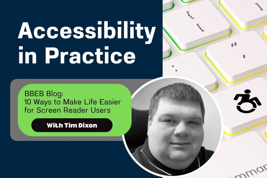
This post continues my Accessibility in Practice series by expanding on Diana’s 10 recommendations, adding a bit of context from the lived experience of someone who uses screen readers daily.
The Web We Hear
Screen readers like JAWS, NVDA, VoiceOver, and TalkBack translate the code behind websites into speech or braille. They don’t see colour or layout, only structure and logic.
When developers skip those basics, users like me feel it instantly. Buttons without names, images that say nothing, menus that loop forever. But when those same fundamentals are done right, the web becomes fluid and fast.
The 10 Fixes That Matter Most
Diana’s article lays out the essentials beautifully. Here’s her list, with my own take on why each one matters in practice.
1. Start with a clear page title.
This is the first thing a screen reader announces. Without it, you land in limbo. A tab called “Untitled” tells you nothing. A good title should answer “Where am I?” instantly.
2. Use proper headings (H1–H6).
Headings aren’t about making text look big. They’re how users navigate through structure. Most screen reader users move through content by jumping between headings to build a mental map of the page. When heading levels are skipped — for example, jumping from an H1 straight to an H3 with no H2 between — the screen reader assumes that sections were omitted or collapsed. That means users may miss key content entirely, thinking they’ve reached the end of a section when they haven’t. Keeping headings sequential tells a logical story and ensures everyone can follow along.
3. Define your main regions.
HTML landmarks such as <header>, <main>, <footer>, and <nav> act like signposts. They let us skip straight to what we need without crawling line by line.
4. Make every link meaningful.
“Click here” or “Read more” is fine visually, but useless when read out of context. A screen reader can pull up a list of all links on a page, so each one needs to stand alone.
5. Add a ‘Skip to main content’ link.
This simple feature saves time by letting users bypass repetitive navigation. For someone who uses a screen reader daily, that shortcut adds up to hours saved each year.
6. Describe your images.
A missing alt text is silence. A good description paints the scene. Two-thirds of homepages still fail this basic step, according to WebAIM’s 2023 report.
7. Label every button.
“Unlabeled button” is one of the most frustrating phrases a screen reader can announce. Add clear text or use aria-label so we know what pressing it will do.
8. Keep navigation consistent.
Changing the menu order between pages forces us to relearn your site. Consistency equals independence.
9. Use proper form labels and helpful error messages.
Screen readers rely on <label> elements tied to input fields. Placeholder text disappears too soon. And when an error happens, say what went wrong. “Please enter a valid email” is far better than “Error.”
10. Keep focus visible and logical.
Keyboard and screen reader users need to know where focus is. When it jumps unpredictably, access collapses. Avoid focus traps and auto-opening popups that steal control.
Bonus Habit: Test It Yourself
As Diana suggests, nothing beats trying it yourself. Turn on VoiceOver (Mac/iOS), NVDA (Windows), or TalkBack (Android) and navigate your own website without looking. You’ll immediately hear what’s broken and what’s beautiful.
Testing by ear builds empathy fast. You stop thinking in pixels and start thinking in flow.
Accessibility Is Communication
Accessibility isn’t just about ticking compliance boxes. It’s about making sure everyone, whether they read with eyes, fingers, or ears, gets the same story and the same respect.
So, take a cue from A11y Explained by Diana, whose reminder bears repeating:
“Accessibility for screen reader users isn’t charity or compliance — it’s communication.”
Takeaway:
These 10 simple habits don’t just make life easier for screen reader users. They make your site clearer, faster, and better for everyone. Accessibility in practice starts with listening, not just coding.
/Passle/60211dc9e5416a0c14bc63d4/SearchServiceImages/2026-07-02-19-49-36-876-6a46c0d0033b1863554b58f9.jpg)
/Passle/60211dc9e5416a0c14bc63d4/SearchServiceImages/2026-07-08-13-56-35-041-6a4e5713b71ad0ddcec591bd.jpg)
/Passle/60211dc9e5416a0c14bc63d4/SearchServiceImages/2026-07-02-17-02-49-101-6a4699b92a027cc45247ad98.jpg)
/Passle/60211dc9e5416a0c14bc63d4/SearchServiceImages/2026-07-07-15-51-45-769-6a4d2091387a16e32875763d.jpg)